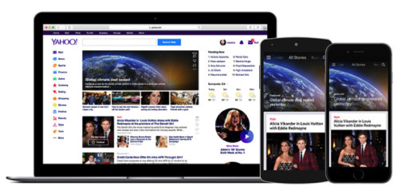
Yahoo Homepage Redesign: An Excellent Experience for Relevant News
Yahoo is rolling out a new and redesigned homepage to deliver a more consistent and information-rich news experience to its users. According to Yahoo, this update is based on the latest mobile trends that showed that news and magazine app usage grew 141% last year.
As you can guess, the latest homepage redesign focuses on news content. It also makes content easier to find and consume because of its nearly infinite news stream. Yahoo, in its own words, says:
”You no longer need to open individual articles in multiple browser tabs. Instead, you can simply scroll through related stories inline.”
An important thing to note here is that the new homepage design by Yahoo is very consistent with how content appears on mobile devices.
There are a few more interesting features that we should highlight here.
First of all, the new redesign not only makes the homepage prettier, it also makes it more intelligent and independent. So, when a user continues to use the new Yahoo homepage to find interesting content and news, it starts curating the stories that is most relevant to that particular user. You can see the editor-selected news stories at the top of the homepage, and alongside the top stories, a particular set of content that is most relevant to you.
Another feature is that breaking news stories can be now followed in real-time. You get an option for instant notifications when a story is updated and developed further.
All these features are designed to make the contents more engaging for Yahoo’s users. To continue with that approach, Yahoo has also added comments directly inline with news stories. It makes the entire news-reading experience more interactive and engaging.
There is no doubt that the new Yahoo homepage redesign does look very good, and t also has some great features. We’ll keep you updated if anything new comes up!


