
Product Page Optimisation: For Better Rankings and Conversions
Product pages are the lifeblood of many online business. However, poorly designed product pages neither perform well in search engines nor convert traffic visitors.
Following are a few proven tips on how to optimize your product pages, increase organic traffic, and improve the conversion rate.
Title of the product page
The title of a web page is always important. A product page, therefore, is no exception.
There are a few points you need to remember when creating the title of your product page:
- Make sure it has the right keywords that you are targeting for your product. Give your web page the best chance to rank higher in the SERPs for the right keyword and keyword phrase.
- The title should be displayed clearly on the top of the page. Readability is the key here.
- Wrap the title in the H1 heading tag to let search engine crawlers know that this is important.
Meta description
Many online marketers may forget the importance of meta description — perhaps because it is not always meant for users. However, the meta description is essential because it helps search engine crawlers understand what your web page is about.
Furthermore, the meta description also plays a key role in the SERPs and encourages more users to click on your result.
Make sure your product page has an engaging and keyword-rich meta description.
Long-tail keywords
Product pages are not always created with search engine rankings in mind. That’s fine, but you still can’t leave opportunities on the table.
Give your product page the best chance to rank higher in the SERPs by including relevant long-tail keywords in the content. From the title to the copy, include long-tail keywords naturally.
This will optimize your web page for higher search rankings for relevant keyword phrases.
High-quality, compressed product images
A product page is incomplete without product images. Depending on the design, you might need one or many product images.
The best practice is to include as many product images as necessary. If it’s a product that the user will need to examine thoroughly, add images from different angles.
However, the key part is to include high-quality and compressed product images that do not hog your site’s resources. The loading speed of your product page is extremely important, and you don’t want to compromise on that.
Let’s talk more about the loading speed.
The need for speed
The loading speed of your web page not only affects traffic and search engine rankings, but it also has a massive impact on the conversion rate. And isn’t conversion rate the entire point of a product page?
According to a study, 47 percent of customers expect a web page to load in less than 2 seconds. The study also revealed the average conversion rate (1.9%) for a web page that took 2.4 seconds to load.
However, for web pages that took 4.2 seconds to load, the conversion rate dropped to less than 1%.
Make sure that your web page loads as fast as possible. Ideally, it should take less than one second to load and be fully ready.
To learn more speed optimization, read our free guide on website loading speed.
Include reviews and social proof
84 percent of people trust an online review as much as they trust a recommendation from a friend.
Therefore, it is important to include as many reviews, testimonials, and feedback as you can. By including social proof, you are removing psychological barriers that the customer needs to cross to make the transaction.
When it comes to reviews and social proof, both quality and quantity matter. 49 percent of online consumers evaluate the quantity of online reviews, so it isn’t just about the quality of reviews.
A call-to-action
The call-to-action — which is directly responsible for the conversion rate — is often the most important part of a product page.
Here are a few best practices to follow when creating the call-to-action for your product page:
- Make sure it is clearly visible on the page.
- It has to be in the right place. Use heatmap tools if you are not sure which area is getting the most attention.
- Use the right color scheme for the CTA button. It is important that the call-to-action stands out on the page without looking add.
- Use familiar terms, e.g., “add to cart”, “buy now”, “purchase”, “submit your order”, etc. Having said that, it is also crucial to test different CTAs to make sure you are getting the best results.
Learn more about CTA A/B testing.
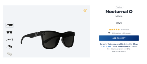
Here is an excellent example of a call-to-action. It’s clear, familiar, and pops up perfectly.
Conclusion
Product pages can be tough to optimize. However, if you are driving a reasonable amount of traffic to it, you will be able to run A/B tests, make necessary tweaks, and optimize it for the best possible conversion rate.
Use the tips mentioned above to build the right foundation and maximize your sales.



Thanks for sharing about conversion rates. The way of expressing things and speaking about the digital marketing is brilliant. If possible, please share about digital marketing strategy framework.