How to Improve Website Navigation
Navigation is one of the most important aspects of your website. It not only allows users to easily browse and find important web pages, but the overall user experience and positive (or negative) signals may also have an impact on your site’s search engine rankings.
The main objective of website navigation is to enable users to find the content they need in the easiest and fastest way possible, but that’s not it. Search engine crawlers also use website navigation to discover and index new pages in the SERPs.
Moreover, the way your website is structured helps search engine crawlers understand the context of each web page in the grand scheme of things. All of this understanding comes from your website navigation and how simple, intuitive, and user-friendly it is.
Here are a few tips on how to improve your website navigation, which, in turn, will help you improve user experience on your site and your search engine rankings.
1. Create proper content hierarchies
The first step to improving your website navigation is to create a proper content hierarchy. The content structure on your website will help set the right direction.
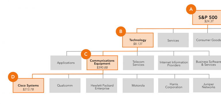
Here is an example:
Ultimately, the goal is to create content categories that make sense to users and search engine crawlers when they go up and down the hierarchy.
In addition, we also recommend creating horizontal links to and from pages within the same hierarchical level. Creating too many silos and isolated pages too deep within the site, and with no internal links to support them, may be detrimental to their rankings in the search engine results pages.
2. Category titles should be SEO-friendly
When you create the content hierarchy, you will end up with plenty of categories and subcategories. There are three things you must ensure:
- Make sure all those categories and subcategories have search-engine friendly titles that your website visitors are also familiar with.
- Second, make sure all the categories and subcategories are clearly presented, visible, and easily accessible.
- Lastly, it is important that categories are clearly distinguishable from subcategories in the main menu.
3. Create clickable links
Creating many categories and subcategories will result in plenty of web pages and navigation elements on your site. Therefore, it is crucial that there are also plenty of clickable links to support easy navigation.
If there is a navigation element — a separate web page, a subcategory, or a category — it should be a clickable link that would easily redirect users to the destination page.
4. Make sure each page has a functioning search box
You can make it easier for your website visitors by creating content hierarchies, presenting a list of important web pages in an accessible way, and creating lots of clickable links, but it might still not be enough.
You cannot predict what they need to find every time and create a page for that.
That’s why you need a functioning search box on every page, so users can easily search for and find the exact content they need.
Ideally, the search box should be at the top-right corner of your website header — because that is the most common position, and users would expect to find it there.
5. Use a breadcrumb trail, if needed
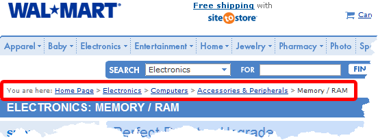
If you have a big content hierarchy, you can also use a breadcrumb trail. It looks like this:
But most of the time, you wouldn’t really need it — unless you are a big e-commerce store.
Unless that is the case, try and see if it is possible to cut down a few subcategories.
6. Don’t use JavaScript in navigation
JavaScript is not the most ideal language for website navigation. Using it may hamper search engine’s capabilities to identify relevant keywords and links for indexing categories and web pages.
Whenever possible, avoid JavaScript in website navigation and instead use HTML5 to make your website navigation more accessible and to make it easier for search engine crawlers to determine important information and index pages in the SERPs.
7. Utilise the footer
Most websites have a footer, but they hardly use it.
You do not have to put dozens of links in there, but make sure to use that space to your advantage.
You can repeat the header links in the footer for people who don’t want to scroll all the way up, or you can expand the header navigation bar and include more (secondary) links in the footer.
Conclusion
A more streamlined and planned website navigation can dramatically improve the user experience on your site.
Figure out the navigational elements that are important for your website visitors and business and then take steps that make the most sense from your visitors’ perspective.
You can then further optimise your website navigation with A/B tests and heatmaps.


