How Many Buying Options Should You Offer for Best Conversion Rates
How many buying options should you give to your potential customers?
It has been a matter of debate for too long. In this blog post, we are going to debunk several myths about it.
One of the biggest myths is that the more options your website visitor and potential buyers have the more likely they are going to buy your products and services.
But unfortunately, it isn’t that simple anymore.
In fact, many conversion optimisation experts believe that the more options you give to your consumers the less conversion rates you will eventually have to settle with. And this is not based on just personal opinions or preferences.
Here is a very popular case study that proves this theory.
The Infamous Jam Study
In the year 2000, a grocery store decided to organize jam-tasting sessions. The good part, however, was that they tried to run an A/B test and track the conversion rates they got from their change in policy.
So instead of running one jam-tasting session, they decided to run two different jam-tasting sessions.
In the first session, they were 24 different flavours of jam available to the shoppers. In that session the shoppers tasted, on average, 2 different flavours of jam. At the end of the session, the conversion rate was 3%.
In the second session, they only had 6 different flavours of jam available for the shoppers. Again, the shoppers, on average, 2 flavours of jam. However, this time, the conversion rate was a whopping 30%.
The conversion rate in this case study was the percentage of shoppers who actually bought a product after tasting all the different flavours of jams.
Why do you think the conversion rates had so much difference in these two different sessions?
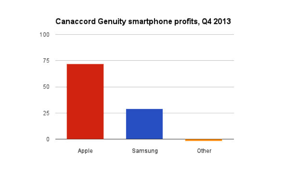
The conclusion was that when you provide too many buying options to your customers, they often get confused and end up buying absolutely nothing. This is one of the main reasons why Apple only has a couple of mobile phone products that represent the company. On the other hand, Android has a plethora of options for consumers to buy. And when it comes to sales, Apple always wins hands down.
Of course, there are many more factors involved in the Apple vs. Android example, but the problem of offering too many choices still remain valid.
The bottom line is that when it comes to offering a variety of products and services to your potential buyers, stick to the fewer side. Offering only a few (but very high-quality products to your consumers) are more likely to convert better than offering too many choices that end up confusing them.
Pricing Options
When you are designing a pricing page, however, the equation takes a slightly different turn.
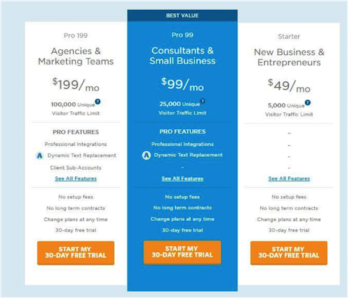
One of the common and best practices in that scenario is to have 3 different pricing options for your website visitors to choose. This is why you see so many popular websites and brands have a pricing page like this:
This 3-option approach ensures a nice balance between giving too many options and limiting your consumers to too fewer choices. It turns out to be the perfect pricing model to have on your website landing pages.
There is another important thing to learn here.
Although the landing page offers 3 different pricing structures, it subtly persuades them to buy only one. In other words, it tricks them into thinking that they have three different options. And while technically speaking they do have three options — they are free to choose whichever option they want — by subtle techniques, businesses persuade them to buy a particular pricing model.
For instance, look at the above image.
You will notice that the ‘Pro Plan’ is highlighted and is tagged with ‘Best Value’. These are small tactics that manipulate the buying decision of your consumers — and no, it isn’t some evil technique.
In fact, with this technique, you recommend a pricing model that has been popular with your target audience and also provides the best possible value. It’s a win-win.

