6 Ways to Get More Opt-Ins and Increase Your Email Subscribers
“The money is in the list.”
You must have heard this expression a thousand times by now. It is, however, the only truth that you must understand in order to succeed at digital marketing.
Let’s explain it one more time…
You publish content on your website for a reason. Every website wants to monetise their online marketing efforts. Their goals may be different, but they all want the same thing in the end, i.e., to convert traffic visitors into regular paying customers.
Getting your website visitors into email subscribers is the first major step towards that. According to very popular research, email marketing offers the best return on investment. For every $1 spent on email marketing, you get an average of $40 of revenue.
If you want to succeed in the online marketing world, you need to build your email list. In this post, I’m going to discuss 6 ways to get more opt-ins and increase your email subscribers. By acting on the tips I mention in this article, you will be able to steadily get more subscribers.
Let’s see what these ways are.
1. Separate Squeeze Pages
A lot of bloggers and online marketers underestimate the power of “squeeze pages”.
Every webpage has a different purpose. Yet, the only purpose of a well-crafted squeeze page is to “squeeze” the contact information out of its visitors. This is why they work so well.
Squeeze pages work better when you have something valuable to offer to your website visitors. This is one of the reasons why so many bloggers give away free products, discount coupons, ebooks, limited-time discount offers, free trials, etc.
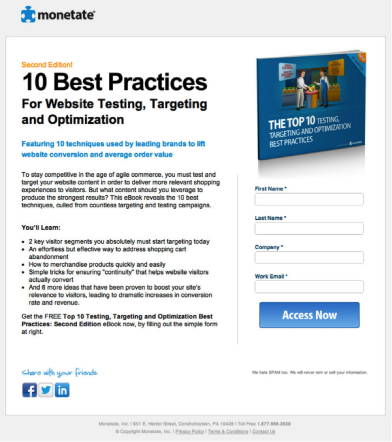
Here is an example of a squeeze page. Notice how it encourages people to sign up. It doesn’t have any other purpose other than squeezing the email information out of its visitors.
LeadPages and ThriveLeads offer some of the best squeeze page designs that you can start using right away.
2. Top Bars
Call them whatever you want, but these little opt-in bars at the top of your website can bring you a lot of good email subscribers.
If you are one of those marketers who don’t like to frustrate their readers with annoying pop-ups, you should be using the opt-in bar. Almost all the famous bloggers are now using them and producing great results. Darren Rowse, Neil Patel, Noah Kagan, and almost everybody else is using these little opt-in bars.
ThriveLeads, SumoMe, Hello Bar, and OptinMonster are some of the best tools to offer a good, customisable opt-in bar for your website.
3. Customised Headers
Another very effective technique to increase your email subscribers is to have customised headers at the forefront of your website.
Whenever someone lands on your homepage, they are greeted with a well-designed and goal-oriented header that encourage them to sign-up. If you do it right, it can easily become your #1 source for new email subscribers.
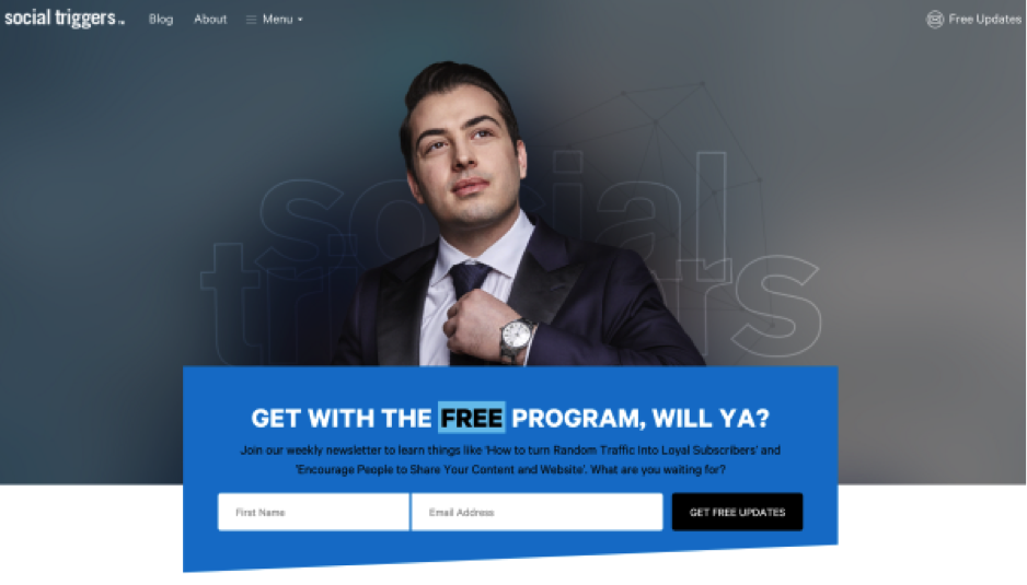
Here is an example of a good header design that allows email subscription.
You can create these header designs by tinkering with your theme options. Most website themes offer some sort of options to help you design such customisable headers. On the other hand, you can also use plugins, such as, PlugMatter.
4. Welcome Mats
Take headers one step further and you have “Welcome Mats”.
Unlike headers, welcome mats take the entire screen and promote your email subscription list.
SumoMe offers a free as well as paid ‘Welcome Mat’ tool that does the job perfectly. You must have seen many websites using this wonderful tool.
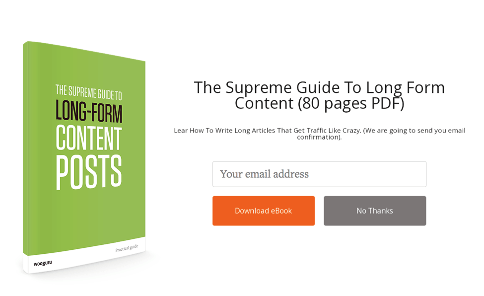
Here is an example of a complete Welcome Mat.
In this image, it may look like a full-fledged landing page. However, when someone visits the homepage of your blog, they are “welcomed” by the welcome mat. If they decide against the offer, they have the option (unlike a landing page) to scroll down and start reading your blog as they normally do.
5. Pop-Ups
Unfortunately, pop-ups are a little annoying. But they work.
Many bloggers and online marketers don’t like using pop-ups as they believe it will hurt their credibility and readership, yet research by HubSpot indicates that it isn’t always the case. According to this study, pop-ups product great results and don’t hurt your website. Just make sure you do it right.
By the way, if you are afraid of doing it wrong, read the next tip.
6. Exit Intent Pop-Ups
As I said, there are many website owners who don’t want to interrupt their readers with pop-ups while they are reading the content. For those bloggers, the exit intent pop-ups do the job.
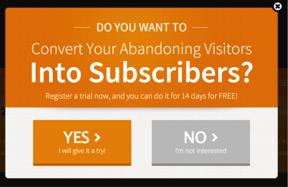
With the exit-intent feature, pop-ups don’t appear until the very last moment when the user is just about to quit the website. This is when your email subscription offer is displayed. In this way, you do not annoy the readers. Besides that, they would be already leaving your blog anyway, so showing them a pop-up won’t hurt you in any way possible.
It’s a great technique that can produce exceptional results.
For creating such exit-intent popups, you can use the following tools:
Final Words
Increasing the email list is a necessary step towards digital marketing success. This is why it’s my recommendation not to rely on one method. Instead, mix multiple tactics to have a better overall result. And don’t forget to test what works and what doesn’t.

