6 simple tips for improving the conversion rate on your website
Do you know that 92 percent of website visitors usually have no intention of purchasing anything?
This is one of the reasons why so many website owners and marketers struggle with maintaining a profile return on investment (ROI). Driving traffic visitors to websites requires time, effort, and money. If a huge majority of those visitors is not buying anything, it just increases the cost of operations without yielding any profit.
By improving the conversion rate on your website — by encouraging more than 8 percent of traffic visitors to purchase — you can directly affect the bottom line of your business and increase profits.
Here are a few simple tips for improving the conversion rate on your website.
1. Website design
The websites that have an excellent conversion rate are the ones with user-friendly and intuitive designs.
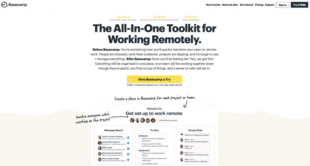
Simplicity is another important factor that the website design must be based on. If the design is too cluttered, visitors would be easily distracted. A simple and minimalistic design also gives you more opportunities to highlight the primary call-to-action.
Take a look at the following design example by Basecamp.
2. Navigation
The navigation of the website also plays a key role in guiding visitors to the call-to-action.
In the previous example, the primary CTA could simply be displayed above the fold. However, that isn’t always the case — especially for e-commerce stores.
Sometimes, a website — for example, an online clothing store — may have dozens or even hundreds of products to sell. Each product will require a separate landing page.
It is the role of the website navigation structure to ensure that visitors are able to reach all the landing pages easily and quickly. An intuitive main menu, a robust internal linking structure, and a logical website structure are a few things that can help you improve the navigation system of your website.
3. Copywriting
It is unrealistic to expect a high conversion rate without good web copy.
While the design may hook visitors in, it is ultimately the text on your website that would convey the real benefits of a product or service and encourage them to complete the transaction.
Here are a few tips to follow:
- Use action verbs.
- Clearly state the benefits of your product or service.
- Do not just rely on features and technical jargon.
- Pay special attention to your headline.
- Brainstorm multiple headline options and then choose the best possible option.
- Use the Headline Analyzer tool to gauge the emotional marketing value.
4. Fewer form fields
It is easy to get tempted and use multiple form fields for gathering as much data as possible right away. However, it is not always a good strategy.
The idea is to remove the barriers for potential barriers and make it as easy and simple as possible to complete the transaction.
Even one additional form field may decrease the conversion rate by 11 percent.
5. Use testimonials and social proof
Customer testimonials are an essential part of online businesses. Verifiable testimonials increase credibility and make it easier for visitors to complete the transaction.
Consumers crave social proof — especially if they are visiting your website for the first time. Moreover, 70 percent of consumers look at online reviews before they buy a service or product.
According to a study by Nielsen, 70 percent of people will trust a recommendation from a complete stranger, and 92 percent will trust a suggestion from a peer.
By demonstrating credible social proof and independent validation from others, you can have a positive impact on the overall conversion rate of your website.
6. Optimize the conversion funnel
Last but not least, to maximize the conversion, rate you will need to optimize the conversion funnel.
Different businesses may opt for a slightly different conversion funnel — depending on their niche and audience type. Generally, a conversion funnel usually has four stages:
- Awareness
- Interest
- Consideration
- Decision
Ideally, you want everything on your website to work together in accordance with the conversion funnel. We recommend starting from the behavior flow report in Google Analytics to understand how your visitors engage with your website and its different pages.
Once you have enough data, try to test different elements.
Try to make content “sticky” and engaging to decrease the drop-off rate. Add fresh content, update information and old references, and include new images to make the pages more interesting.
Conclusion
Improving the website conversion rate is an excellent way to quickly increase revenue without spending more on paid ads or inflating operational costs.
Use the tips mentioned above and A/B test different elements on your site to increase conversion rate.


